INHALE is a cultural platform where artists are presented, where great projects are given credit and readers find inspiration. Think about Inhale as if it were a map: we can help you discover which are the must-see events all over the world, what is happening now in the artistic and cultural world as well as guide you through the latest designers’ products. Inhale interconnects domains that you are interested in, so that you will know all the events, places, galleries, studios that are a must-see. We have a 360 degree overview on art and culture and a passion to share.

Berlin-based Hidden Fortress was asked to design a flexible interior for the Bazar Noir shop at Kreuzbergstrasse 78, to accommodate the store’s constantly changing display of unique objects and accessories for the home.
The store’s owner Catherine Pfisterer wanted the firm to keep the high ceilings of the existing space as well as retain some of the atmosphere that the building had in its raw state, while creating a strong identity for the shop.
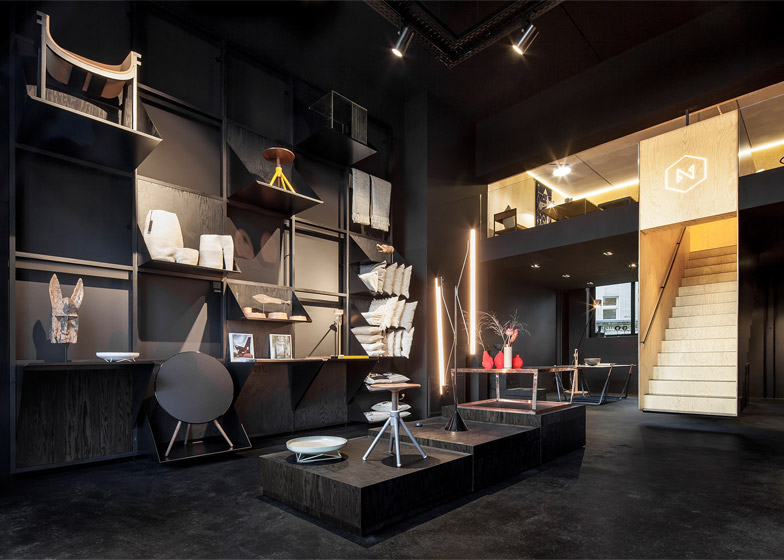
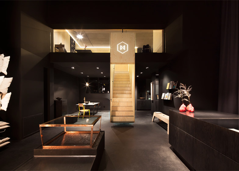
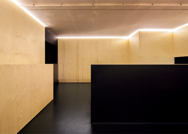
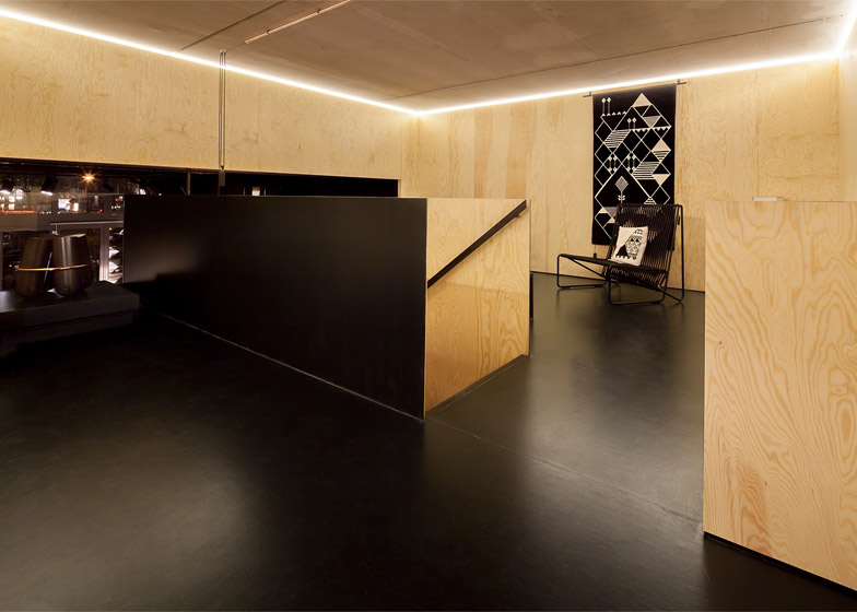
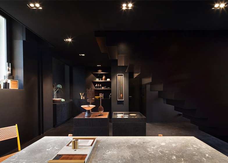
Jan Maley of Hidden Fortress used black finishes to unify the space, covering all the surfaces in the same tone. A new mezzanine was created and lined with unpainted maritime pine to create a strong visual contrast between the levels.
“The challenge was to realise the same [black] tone in a variety of surfaces, materials and production methods,” said the designers.”Using maritime pine as a main component provides a strong image due to its large grain, in its original colour light white/yellowish as well as in tinted black.”
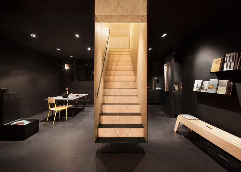
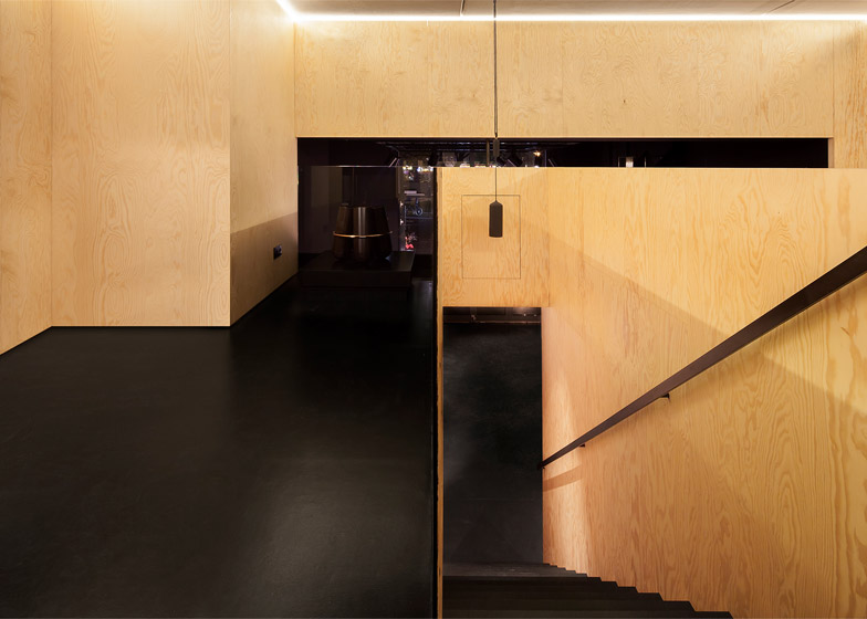
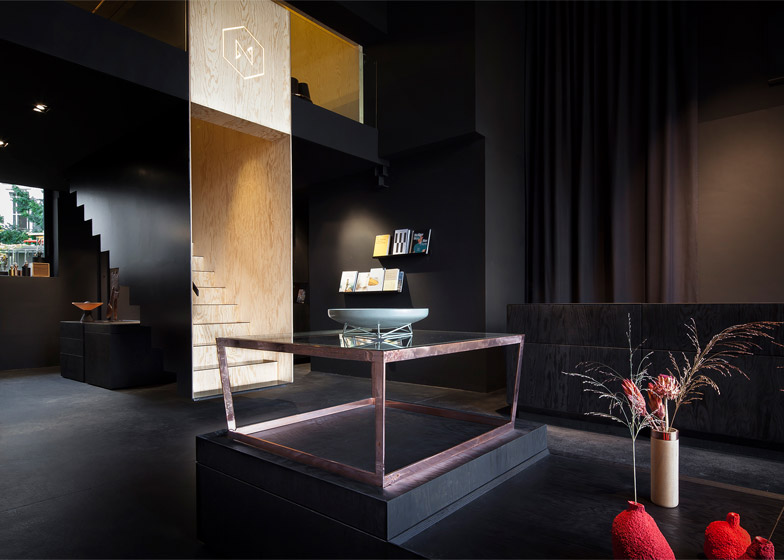
The same pine was used to create bespoke fittings for the lower floor as well as a staircase that dominates the middle of the space.”Thus the upper floor with its strongly different atmosphere could at the same time be integrated and separated from the darker main floor,” explained the designers.
Enclosed on four sides by pine wood walls, the staircase is painted black on the outside with the inner surfaces left natural.
It projects out from the mezzanine level, but never actually touches the floor, creating the illusion of floating stairs. Its casing provides the structural strength to keep the staircase rigid.
Downstairs, the designers created a bespoke display system of square frames to cover a wall at the front of the space. Individual shelving modules made in three different sizes can be attached to the frames and moved around to accommodate different heights and sizes of objects.
“The arrangement of the modules in the framework can result in a strongly geometrical image or in a playful seemingly more chaotic structure,” said the designers.
Made from laser-cut, powder-coated aluminium, these modules share the same triangular profile from the side, but have different widths and depths. Smaller modules made from copper and glass match accents used on display cases elsewhere in the store.
A black pine counter occupies the space along the wall on the other side of the shop, while a lower display plinth made from the same material sits in between.
A rectangular metal lighting rig on the ceiling provides a flexible lighting arrangement for a set of strong spotlights, that can slide on runners and pivot on hinges to change the angle of each beam.
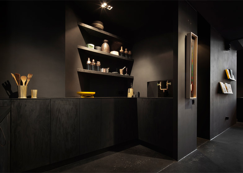
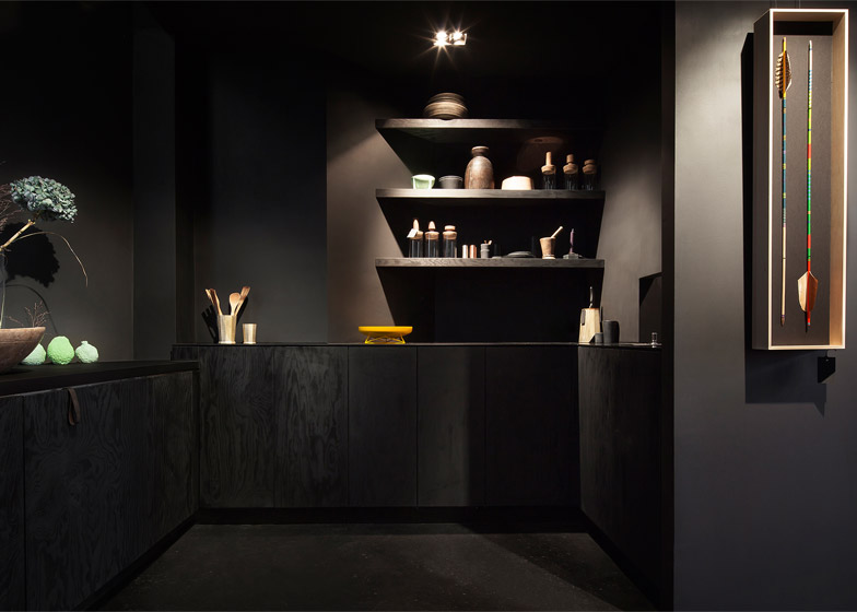
At the back of the ground floor, a kitchen has been created for making tea for staff and customers. It is also used for displaying the store’s range of kitchen items.
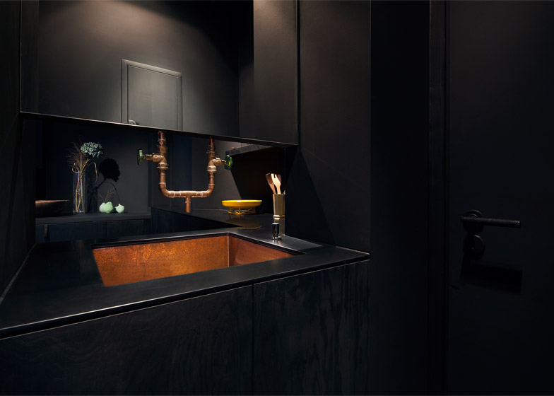
The kitchen features a copper sink and pipework, intended to create a connection between the displays and the functional elements of the store.
The rear area downstairs is lit by groups of three spotlights set into the ceiling, arranged in regular intervals.
“The divisions and connections between these areas and between the two floors, are designed to allow a variety of new perspectives while one wanders around in the space,” said the designers.
“This softens the division between the upper and lower area, and contradicts the stronger division of dark downstairs and light upstairs. The result is a strong feeling of a homogeneous space in spite of its division between the two floors.”
The mezzanine level provides further display space for furniture and large items, and is fronted by a glass wall to create a visual connection as well as a sense of openness that prevents this smaller space from feeling cramped.
A continuous strip of lighting is embedded into the joints between the walls and the ceiling around the edges of the space.
via www.dezeen.com


