INHALE is a cultural platform where artists are presented, where great projects are given credit and readers find inspiration. Think about Inhale as if it were a map: we can help you discover which are the must-see events all over the world, what is happening now in the artistic and cultural world as well as guide you through the latest designers’ products. Inhale interconnects domains that you are interested in, so that you will know all the events, places, galleries, studios that are a must-see. We have a 360 degree overview on art and culture and a passion to share.

Snarkitecture is a collaborative practice operating in territories between the disciplines of art and architecture. Working within existing spaces or in collaboration with other artists and designers, the practice focuses on the investigation of structure, material and program and how these elements can be manipulated to serve new and imaginative purposes. Searching for sites within architecture with the possibility for confusion or misuse, Snarkitecture aims to make architecture perform the unexpected.
Snarkitecture was established by Alex Mustonen and Daniel Arsham.
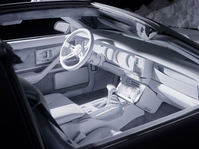
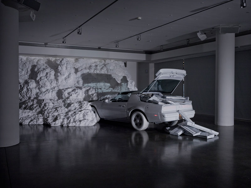
In collaboration with Chromeo, Snarkitecture created The White Room, an installation at Milk Gallery that included new music from their upcoming album. A vintage sports car filled with Chromeo’s musical equipment was transformed into a a series of all-white, matte objects intersected with an immense excavated landscape.
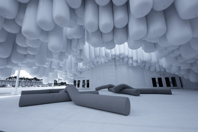
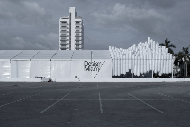
An entrance pavilion for Design Miami/ 2012, Drift creates an unexpected moment within the context of the familiar white vinyl tent, reformulating the material to create a floating environment. Inflated tubes are bundled together to create a topographical landscape in suspension: an ascending mountain above and an excavated cavern below. These long cylinders are arranged vertically to infill the area of the entrance courtyard, and then lifted to create areas of circulation and rest for the visitors entering and exiting the structure.
Filtered light passes between the tubes of the inverted landscape creating a space both interactive and contemplative. Apertures in the canopy above frame views of the Miami sky and allow natural light and fresh air into the interior. The lightness of the floating tubes underscores the mass of the enormous installation, visible from a distance of several blocks. Drift identifies the entrance courtyard as a site of activity and design. The rising landscape becomes a beacon for visitors approaching Design Miami/ while the excavated cavern presents a moment of exploration before entering the fair.
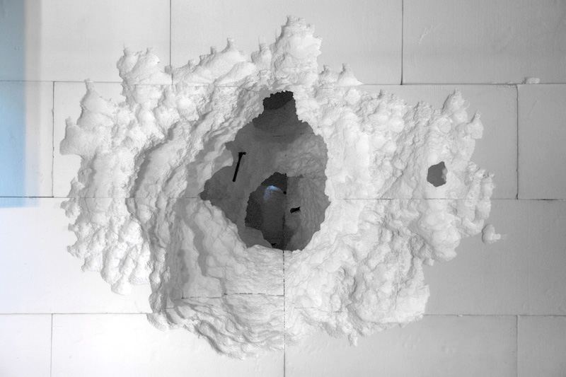
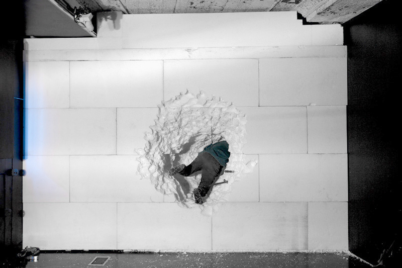
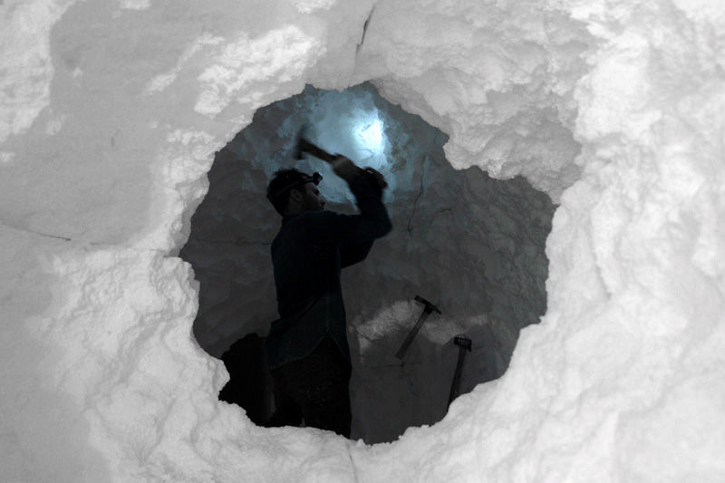
Dig was an exhibition and performance at Storefront for Art and Architecture by Daniel Arsham/Snarkitecture that explored the architecture of excavation. Storefront’s distinctive gallery space was filled with a solid volume of EPS architectural foam, engulfing the existing interior in an unyielding flood of white. The volume was then excavated using simple tools – hammers, picks and chisels – to transform a stock industrial material into a strange, unexpected cavern for both work and play.
An exhibition documented the ongoing dialogue between ideas of notational precision and fabricated looseness. This negotiation of design logic with sculptural intuition sets the stage for the interaction between the artist and viewer. Daniel Arsham/Snarkitecture created and inhabited Dig for the duration of the subsequent month-long installation, carving spaces from solid infill in a performance open to public view. The façade of Storefront became a human ant farm, framing the work occurring within for outside passerby. Inside the remaining gallery space, a cave-like entrance opened into the solid form, inviting viewers to watch the excavation of an unreal space in real time.
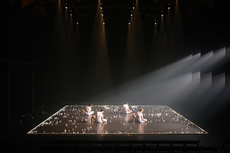
A collaboration with choreographer Jonah Bokaer, Why Patterns is a performance in which the visual design emerges from a single table tennis ball that is introduced into a frame on stage, initiating a series of choreographed games. Unpredictable results trigger events that flood the stage with thousands of balls, which are manipulated by the movements of the dancers as the square frame is collapsed.
Why Patterns from Snarkitecture on Vimeo.
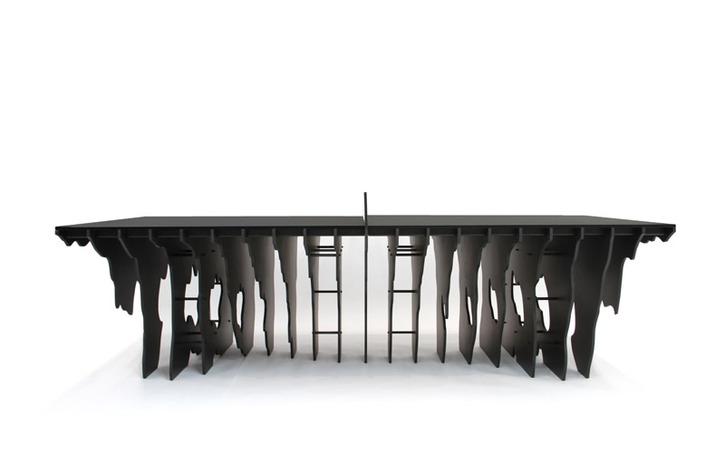
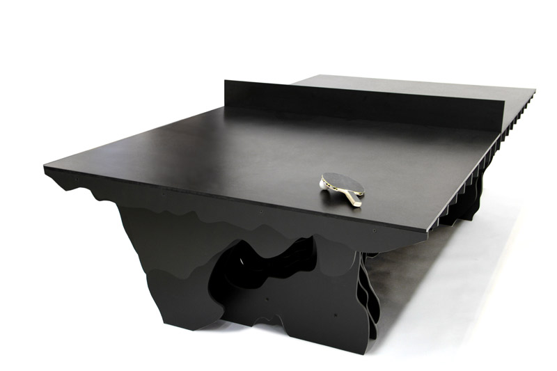
An all black table tennis table, Slice appears as a deceptively opaque landscape when viewed from its shorter ends and impossibly thin from its longer sides. The top is made from a single thin sheet of Richlite, an incredibly dense and durable eco friendly material. An undulating topography below this surface is described by a series of flat, solid layers made from flexible EPDM rubber and Richlite. While designed for indoor and outdoor table tennis, Slice can also be used as a conference or dining table.
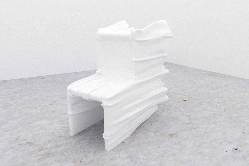
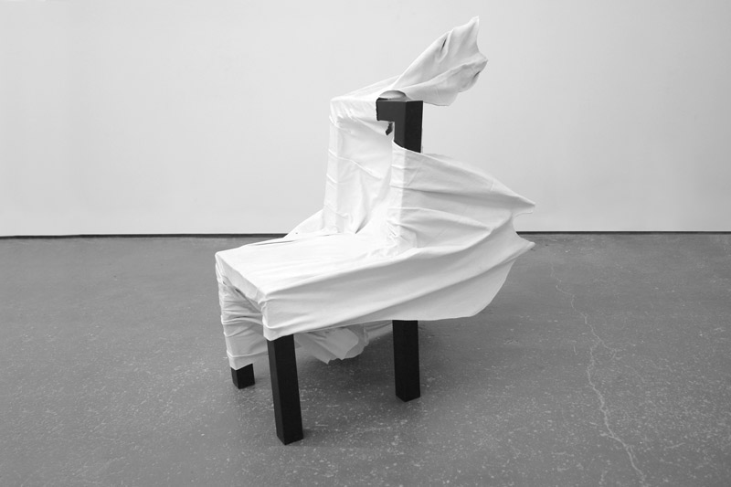
Ghost Chair
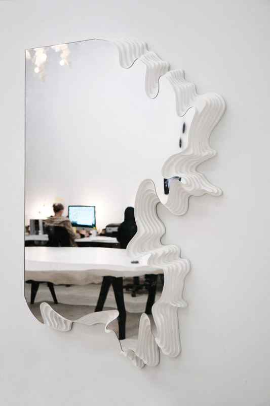
Excavated Mirror (Positive/Negative)
via snarkitecture.com


