INHALE is a cultural platform where artists are presented, where great projects are given credit and readers find inspiration. Think about Inhale as if it were a map: we can help you discover which are the must-see events all over the world, what is happening now in the artistic and cultural world as well as guide you through the latest designers’ products. Inhale interconnects domains that you are interested in, so that you will know all the events, places, galleries, studios that are a must-see. We have a 360 degree overview on art and culture and a passion to share.

Martin’s space is on the opposite end of that visual spectrum—bursting with color and imagery. Every corner is alive with thought, color and form. “I love being greeted by my studio in the morning,” Martin said with a smile. “This is my home.”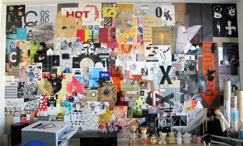
Martin started making collage walls back at Cranbrook. I’ve seen many students create their own walls in a similar fashion, tacking up inspiration or pieces of their work as they make it. It’s a great exercise for gaining distance and reflecting on one’s work. But I have yet to see a wall or a collection as controlled and visually rich as Martin’s. Each of his walls is built piece by piece. It’s the most meticulously concentrated bricklaying imaginable, a reflection of Martin’s masterfully critical eye.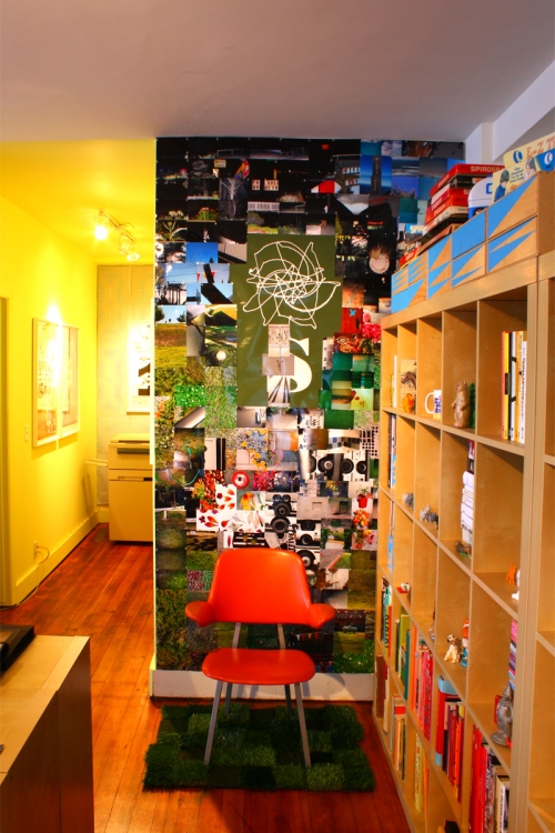
His system for image placement is largely driven by the results of juxtapositions from pieces of his design process. Stories emerge as one image plays off the next, which plays of the next, until the space is full, resulting in a visual orchestra, serenading the viewer for a closer inspection and deeper contemplation.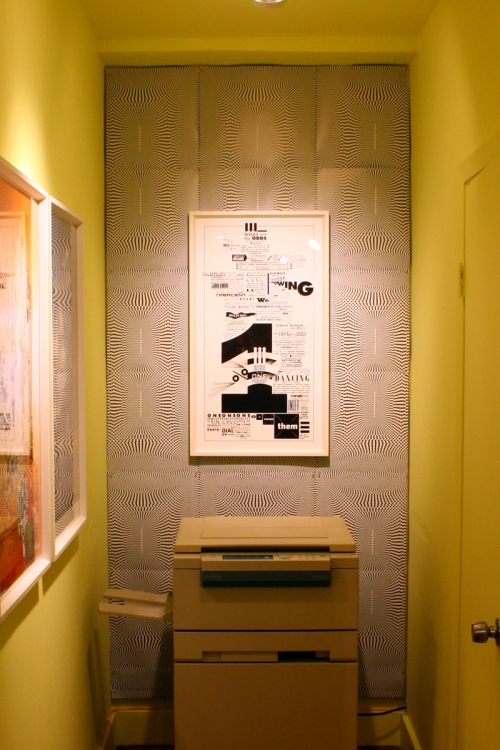
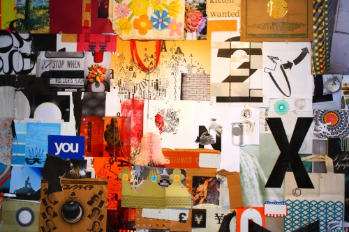
When Martin graduated from Cranbrook, his first few jobs weren’t as creatively fulfilling as his time in school. Looking to remedy the situation, Martin sought the advice of Elliott Earls, head of the Graduate Graphic Design Department at Cranbrook. Elliot encouraged Martin to build a space that allowed him to be as creative and comfortable as possible. Soon, the collage walls were reborn, first at the office of Speak magazine and later, in 1997, at Martin’s first studio.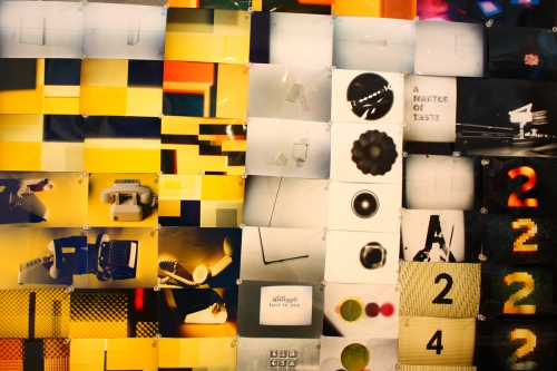
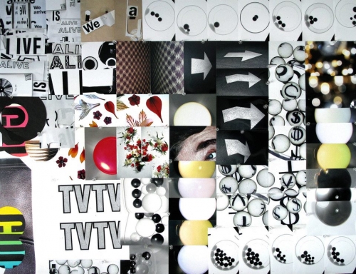
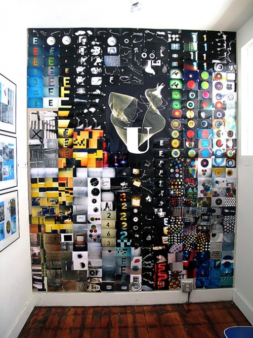
Martin has built and rebuilt his collage walls each time he’s moved. Asked if he ever threw anything out, he replied with a scolding, “No!” If a piece wasn’t on a wall, it was neatly organized within a box of other artifacts, waiting for its time to shine on the wall. A completely annotated version of one wall was published in Martin’s monograph It is Beautiful… Then Gone, providing a glimpse into the story behind each image that created these facades of graphic beauty. Like a Gothic cathedral covered in friezes and statues, Martin’s studio walls are a reflection of its content.


